I explain here how to do it in Excel. But the principle is general. You can produce this type of visualization with other tools. There are many features in Excel that allow you to generate marketing-style pictures. I never really used them, as the result can be cheesy. If overused, you end up with material that looks like advertising from a Casino, or like the “old world wide web”, where blinking fonts and documents with neon colors were popular. But I recently decided to give it a try again, using extreme moderation. I believe my experiment was successful. I will leave it to the reader to have a final say about it.
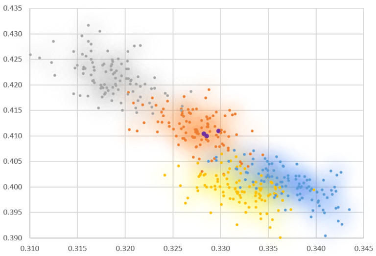
Before showing what I believe is a good use of the Excel “cheesy features”, let me show you my first attempt, several years ago. It backfired: some readers complained about the unnecessary bells and whistles. And it is true that in this case (see Figure 1), it serves no purpose. I haven’t used this type of style (or lack of) ever since.
Read full article (and how to make these visualizations look professional), here.


No comments:
Post a Comment
Note: Only a member of this blog may post a comment.